

Let’s be honest: picking brand colors can feel like a weird form of identity crisis.
Do I go minimalist and beige like every luxury Instagram account? Do I dive headfirst into dopamine brights? What are my colors saying about me—and do they even match how I want to be seen?
If you’ve ever found yourself 47 pins deep into a “branding inspo” rabbit hole at 1am with five moodboards and zero clarity…you’re not alone.
But good news: color isn’t just about aesthetic—it’s a tool. A shortcut to connection. A strategic choice that can help you stand out, signal trust, and sell more when used well.
In this post, we’re diving into modern brand color palette ideas that look good and do their job. No fluff, no color wheel theory lectures. Just smart, scroll-stopping combos designed for real businesses and real buyers—plus tips to choose the right one for you.
Why Your Brand Color Palette Matters
Before we get to the juicy swatches and inspo boards, let’s get one thing straight: color isn’t decoration. It’s strategy.
Color is one of the first things people notice about your brand—often before they read a single word. It’s how you make a first impression. It’s how you make people feel something. And in a digital world where attention spans are shorter than ever, that feeling matters more than you think.
Here’s the deal:
- Blue says “trust me.”
- Green feels grounded and calm.
- Red grabs attention and raises urgency.
- Black whispers luxury and exclusivity.
- Muted tones say minimalist, curated, creative.
- Bold neons scream energy and youth.
So whether you’re building a soft and supportive coaching brand or a punchy, high-contrast creative studio, your color palette is doing a lot of heavy lifting behind the scenes.
And if your colors don’t match your vibe—or worse, send mixed signals—you’re going to confuse your audience instead of converting them.
TL;DR: Your brand colors should be more than “pretty.” They should be purposeful. Let’s get you some ideas that nail both.
How to Choose a Brand Color Palette That Actually Feels Like You
Before you pick a palette because it “looks good on Pinterest,” let’s pause.
Choosing your brand colors isn’t just about liking a vibe—it’s about owning one.
You want a palette that feels good to you, yes, but also one that tells the right story, attracts the right people, and makes you recognizable across every touchpoint—from your homepage to your Instagram grid to that random Canva graphic you whipped up at 11pm.
Here’s how to get clear:
🧠 Step 1: Know What You’re Trying to Communicate
Ask yourself:
- What three words do I want people to feel when they land on my site?
(Warm? Sophisticated? High-energy? Bold? Grounded?) - Who am I speaking to, and what colors would speak to them?
- Am I offering luxury, accessibility, creativity, stability—or something else entirely?
This isn’t about color psychology for the sake of sounding smart. It’s about matching your vibe to your visuals.
🎯 Step 2: Pick Your “Power Trio”
Most strong brand palettes include:
- 1 Primary Color – the lead (your website buttons, logo base, social overlays)
- 1–2 Secondary Colors – the accents (subheadings, graphics, icons)
- 1–2 Neutrals – the balance (backgrounds, body text, whitespace support)
You don’t need 7 colors to look legit. In fact, too many options often lead to DIY chaos. Stick to 3–5 max—and choose shades that work well together in contrast and complement.
🔧 Step 3: Use the Right Tools to Explore
Don’t just squint at Instagram and hope for divine inspiration. Use tools that make this easier:
- Coolors – Generates palettes, lets you lock in colors you like
- Adobe Color – Browse trending palettes and test contrast
- [Pinterest] – Search “[industry] color palette” to get niche-specific inspo
- Khroma – AI-based tool that learns your preferences and creates palettes you’ll probably love
Bonus tip: Screenshot palettes that catch your eye, then ask why. Is it the warmth? The bold contrast? The unexpected combo? This reflection helps you reverse-engineer your own style.
Bottom line? Your brand colors aren’t forever tattoos—but they should feel aligned enough to grow with you. The best palettes don’t just look good—they feel right and do their job.
Ready to explore the actual color ideas? Let’s go.
Modern Brand Color Palette Ideas to Inspire Your Next Look
There are endless color combos out there—but not all of them will sell your brand.
So instead of handing you a giant list with no context, I’m showing you curated palettes that actually do something—designed to help you stand out, connect, and feel like you.
Here are a few of my faves, organized by vibe. Pick one that fits—or sparks your own twist.
Soft Neutrals for Calm, Premium Brands
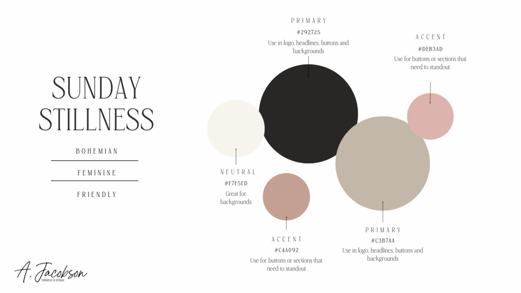
Palette Name: Sunday Stillness
Palette: Warm taupe · Cream · Dusty rose · Charcoal grey
Think: spa-like serenity meets boutique sophistication.
This combo works beautifully for wellness brands, slow-living influencers, interior stylists, or any biz that wants to exude trust, calm, and high-end simplicity.
Why it works:
- Neutrals feel clean and elevated
- Dusty rose adds a gentle, emotional warmth
- Charcoal brings contrast without harshness
Use this if your brand is all about intentionality, calm authority, or quiet luxury.
Muted Pastels for Playful, Polished Pros
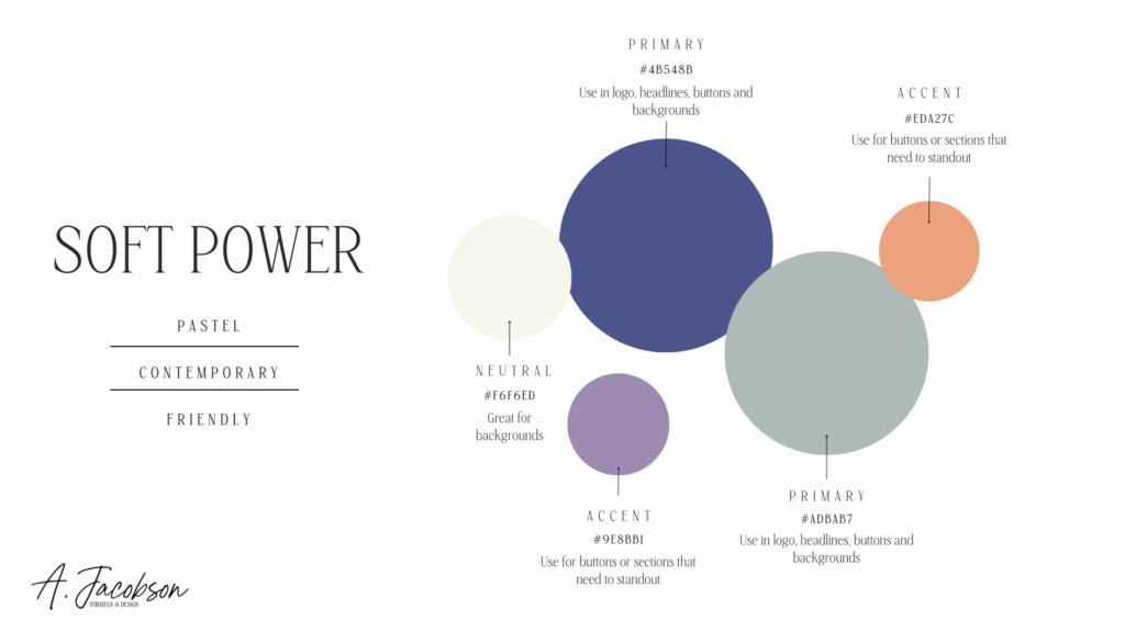
Palette Name: Soft Power
Colors: Lavender · Sage · Soft peach · Eggshell · Deep navy
This is not your basic pink-and-beige situation. These tones are creative, contemporary, and surprisingly versatile. Ideal for online educators, coaches, designers, and brands that balance approachability with professionalism.
Why it works:
- Pastels feel friendly and non-intimidating
- Deep navy grounds the palette and adds trust
- You get range without chaos
Use this if your people want fun—but still take you seriously.
Bold & Moody for Brands That Make a Statement
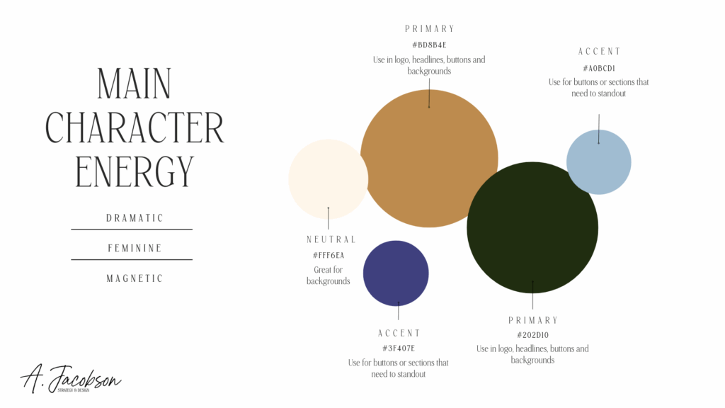
Palette Name: Main Character Energy
Colors: Forest green · Deep plum · Gold · Cream · Black
Dark, dramatic, and magnetic. This palette is perfect for luxury creatives, photographers, fashion brands, or founders who aren’t afraid of a little edge.
Why it works:
- Rich colors spark emotion and curiosity
- Gold signals premium pricing and prestige
- Cream adds contrast and space to breathe
Use this if you want your visuals to stop the scroll and spark a feeling instantly.
Bright & Punchy for Brands That Spark Joy
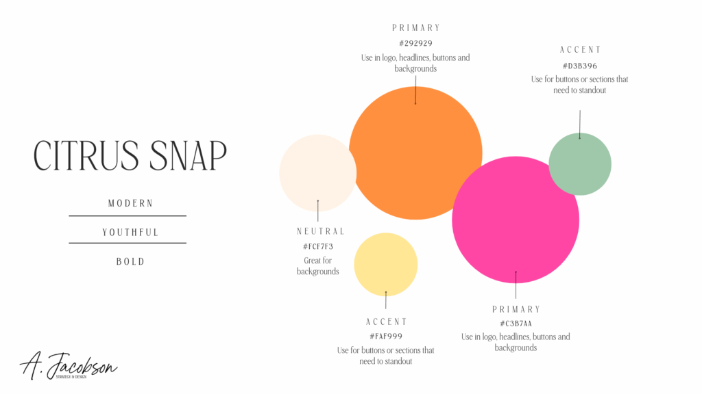
Palette Name: Citrus Snap
Colors: Tangerine · Hot pink · Lemon yellow · Mint · White
Zesty, electric, and impossible to ignore. This palette is for brands that want to energize, excite, and make people smile. Perfect for product-based businesses, content creators, or anyone in the lifestyle or beauty space.
Why it works:
- Bold colors trigger instant emotion
- Mint adds freshness and balance
- White space keeps it clean, not chaotic
Use this if you’re here to wake people up, not blend in.
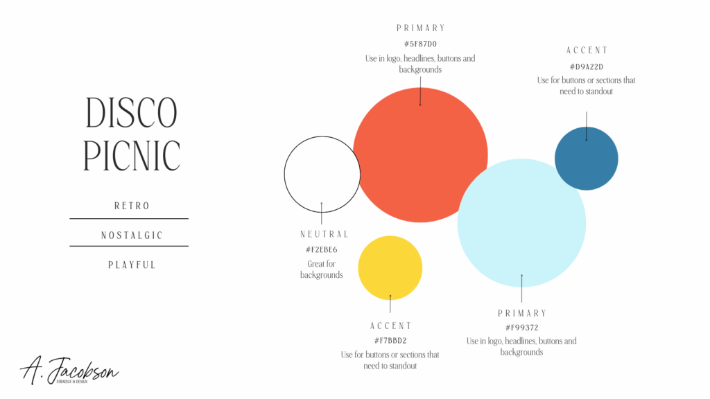
Retro-Playful for Creative Founders & Studios
Palette Name: Disco Picnic
Colors: Tomato red · Mustard yellow · Sky blue · Cream · Teal
This one’s nostalgic and modern—like if a vintage diner had a brand baby with an indie design studio. Quirky, charming, and packed with personality.
Why it works:
- Red + mustard = confident and creative
- Teal + blue = visual stability
- Cream softens the contrast
Use this if you want your brand to feel magnetic, joyful, and “different in the best way.”
Feeling inspired yet? These palettes aren’t just pretty—they’re strategic.
Whether you’re rebranding, refreshing, or building your visual identity from scratch, the key is this: pick a palette that feels like your brand, supports your message, and actually works in real-world application (not just on your Pinterest board).
You don’t need to reinvent the color wheel—but you do need to be intentional. And now, you’ve got the tools and inspiration to do just that.
Now let’s talk about where to actually use those colors so they do the heavy lifting for you.
Where to Use Your Brand Colors (and Why It Matters)
Choosing a palette is one thing—using it well is another. Your brand colors shouldn’t live only on your logo or moodboard. They should show up consistently across every part of your brand ecosystem, reinforcing trust and recognition every time someone interacts with you.
Here’s where to put them to work:
🖥️ 1. Your Website
From your navigation bar to your button color, brand colors should guide your user through the site. A strong primary color draws the eye to key CTAs (like “Book Now” or “Download”), while neutrals support readability and flow.
Pro tip: If your palette is bold, use it strategically—don’t color-bomb every section.
📱 2. Social Media Content
Instagram, Pinterest, LinkedIn, wherever you post—your colors should be obvious but not overwhelming. Use them in backgrounds, highlight covers, templates, and graphics to create scroll-stopping visual consistency.
Why it works: People are 80% more likely to recognize your brand if your visuals are consistent. (It’s science.)
📧 3. Email Graphics + Headers
If you’re sending newsletters or sales sequences, make sure your headers, buttons, and even image overlays reflect your palette. It adds professionalism and creates a cohesive customer experience—even in their inbox.
📄 4. Client Deliverables + PDFs
Your pricing guides, proposals, invoice templates, onboarding docs, and slide decks should feel like your brand—not just carry your logo. Adding brand colors subtly (and smartly) keeps you looking polished from start to finish.
📦 5. Packaging or Digital Product Design
Whether you sell physical goods or digital templates, color builds perception. Want your course to feel luxe? Use rich, moody tones. Want your workbook to feel fun and digestible? Go pastel with lots of white space.
Bottom line? Use your palette like a thread that ties everything together.
It’s one of the fastest ways to build brand trust, boost recognition, and make your business look way more legit—without spending a dime more.
What to Avoid When Choosing Brand Colors
Picking colors might seem like a creative free-for-all—but if you’re not careful, you’ll end up with a palette that looks good in theory and flops in practice. Here are the most common color pitfalls to watch for:
❌ 1. Following Trends Without Intention
Just because everyone’s doing beige or neon or “dopamine brights” doesn’t mean you should.
Trend-led palettes can feel fresh in the moment but often don’t age well—and may not match your actual brand values or audience vibe.
Better move: Choose colors based on your message, your audience’s emotional needs, and how you want your brand to feel in 2+ years.
❌ 2. Overloading on Color
Six, seven, eight colors in one brand palette? That’s not a vibe—it’s visual chaos.
More colors = more decisions = more inconsistency. Especially if you’re DIYing your own designs.
Stick to:
- 1 primary color
- 1–2 secondary colors
- 1–2 neutrals
That’s it. Keep it simple, intentional, and usable across platforms.
❌ 3. Ignoring Accessibility
If your brand colors don’t contrast enough, they’re hard to read—especially for people with visual impairments.
Pale yellow text on a white background might look “chic” in Canva, but it’s a nightmare for legibility.
Use an accessibility checker (like WebAIM or Stark) to make sure your colors pass contrast guidelines. Clear = inclusive and more effective.
❌ 4. Choosing Colors You Like… But That Don’t Align
You love forest green, but your brand is high-energy and playful? That mismatch creates confusion and weakens your messaging.
Remember: this is branding, not interior design. Your favorite color isn’t always the right fit.
Tools to Help You Test + Apply Your Palette
Once you’ve narrowed in on a few color directions, it’s time to test them out in the real world. These tools make it easy to experiment, visualize, and apply your palette across your brand—without needing a design degree.
📊 Accessibility Checkers
- WebAIM Contrast Checker: Checks legibility of text and background color combos
- Stark Plugin (for Figma/Adobe XD/Sketch): Checks accessibility inside your design files
🧰 Moodboard + Brand Kit Builders
- Milanote: Drag-and-drop moodboarding
- Canva Brand Hub: Store your brand colors, fonts, logos in one place and apply across templates
🧪 Pro Tip: Screenshot + Test
Once you’ve landed on a palette, screenshot it and test it:
- As an IG grid mockup
- In a website hero banner
- On a PDF cover or slide deck
What looks good in a vacuum might totally flop in context. Your brand lives in action, not in theory—so test early and adjust.
Final Thoughts + Call to Action
You don’t need to be a designer to choose brand colors that work (but if you need help, I’m always here). You just need a little strategy, a splash of inspiration, and a reminder that your brand deserves more than default blue and a Pinterest moodboard that makes you feel like an imposter.
Whether you’re drawn to neutrals, pastels, or punchy neons, the best palette is the one that helps your audience feel something—and helps you show up clearly and consistently across every platform.
Now go play. Screenshot. Pin. Save. Test.
And when you’re ready to make it official? Build it into your website, your brand kit, and your client touchpoints so it becomes second nature.
TLDR
❓ What are some modern brand color palette ideas?
Modern palettes mix emotional depth with versatility—think muted pastels with navy, bold brights grounded by cream, or luxe moody tones with gold.
❓ How many colors should be in a brand palette?
Aim for 3–5 total: 1 primary, 1–2 secondary, and 1–2 neutrals. That gives you flexibility without overwhelm.
❓ Should I use the same colors on my website and social media?
Yes—consistency builds trust and brand recognition. Use your palette across every platform, just in different doses.
❓ Can I change my brand colors later?
You can, but be strategic. Minor tweaks are fine. Full rebrands should come with intentional shifts in your business, audience, or message.
