

Holiday design has a habit of becoming visual copy-paste. The same reds, the same greens, the same expected typography pulled out every December and put right back when the season’s over. It’s familiar, nostalgic, and safe — which also makes it feel stale fast, especially for designers working with lifestyle, boutique, or visually driven brands.
The thing is, classic holiday type styles exist for a reason. Certain fonts instantly signal warmth, celebration, and seasonality without having to say a word. But the difference between forgettable and memorable holiday design often comes down to how those fonts are used — and what they’re paired with.
This collection of the best holiday fonts leans into that balance. You’ll find typefaces that feel festive without being kitschy, expressive without screaming “December,” and versatile enough to work beyond a single campaign. Think softer scripts, refined serifs, playful details, and modern twists on seasonal classics.
These fonts are especially well-suited for brands that want to acknowledge the holidays while still honoring their overall aesthetic — boutique retail, hospitality, home goods, editorial projects, and modern ecommerce included.
Below, we’ll explore a curated set of holiday fonts that bring seasonal energy without sacrificing taste — so your designs feel intentional, elevated, and unmistakably yours.
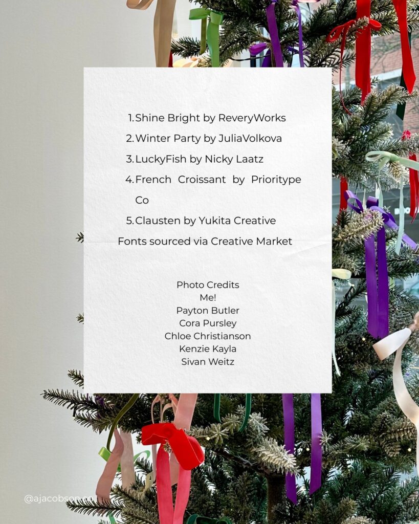
1. Shine Bright by ReveryWorks

This one has a friendly, hand-drawn vibe with a sort of imperfect glow. It is playful without being childish. It gives me gingerbread party energy, but chic. Works great for bold statements, handmade, crafty brands, or anything targeting kids or the kid-adjacent.
Perfect for: festive type treatments, banners, merch, stickers
2. Winter Party by Julia Volkova

If I could bottle holiday chaos (in a cute way), this font would be it. It feels expressive, whimsical, and slightly tipsy. Use it where you want personality and movement without sacrificing readability.
Perfect for: cards, holiday campaigns, cheeky email headers, event invites
3. LuckyFish by Nicky Laatz

Retro diner meets holiday sparkle. Slightly textured, slightly chunky, totally charming. This font is confident and fun, and it works well when you want your typography to be the main character.
Perfect for: bold hero text, brand campaigns, posters, packaging concepts
4. French Croissant by Prioritype Co
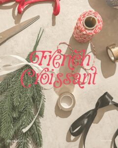
This one feels like Paris at Christmas. Elegant, romantic, just enough quirk to keep it from feeling overly formal. If your holiday aesthetic leans more cozy glam than peppermint chaos, this is your girl.
Perfect for: menus, invitations, gift tags, playful luxury brands
5. Clausten by Yukita Creative

A refined serif that feels classic without being stuffy. Clean contrast, soft curves, and subtle personality make it perfect for brands that want seasonal flair without turning into a Hallmark card.
Perfect for: brand assets, editorial layouts, seasonal website refreshes
How to Use Holiday Fonts Without Looking Like a Mall Poster
A couple quick tips, because seasonal design can get chaotic fast.
- Pick one festive font and pair it with a clean supporting font
- Build a simple palette that matches the mood
- Avoid using multiple playful fonts together
- Make sure your typography is actually readable
- Lean into texture and illustration if you want added personality
Typography carries so much mood. You do not need glitter explosions to signal holiday spirit.
Where to Source These Fonts
All of the fonts featured came from Creative Market.
Links to each designer:
- ReveryWorks
- Julia Volkova
- Nicky Laatz
- Prioritype Co
- Yukita Creative
Support independent type designers (like Jen Wagner, one of my favorites! Get a discount with this affiliate link) this season. They are doing the lord’s work so you don’t have to kern your own letters.
Photography Credits
Because every good design roundup deserves a visual feast:
- Me
- Payton Butler
- Cora Pursley
- Chloe Christianson
- Kenzie Kayla
- Sivan Weitz
If you saw something beautiful or weird, someone made it happen.
A Holiday Reminder for Designers
You do not need to reinvent your entire brand identity every time the calendar changes.
A seasonal typeface, a some festive colors, or a touch of warmth goes a long way.
Have fun. Be extra. Try something silly.
Your brand can survive one festive week of typography drama.
And if you end up using any of these, DM me the design so I can scream with you about it.
Happy designing and happy holidays.
