

Holiday design gets repetitive fast. The same reds, the same greens, the same “safe” combinations pulled out every December and put back in storage come January. If you’ve been searching for holiday color codes that feel seasonal without feeling dated, overdone, or tacky, you’re in the right place.
The truth is, holiday colors work because they’re emotionally familiar — but the magic happens when you tweak the tone, saturation, or pairings just enough to make them feel fresh. This post breaks down modern holiday color codes you can actually use for branding, websites, and seasonal campaigns that still feel like your brand.
1. Gumdrop Lane
Energy: playful, sweet, joyful
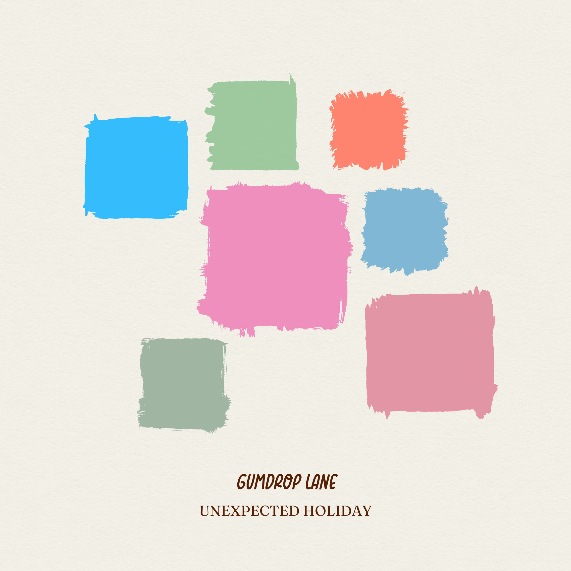
Bright candy tones build on a holiday foundation with a punchy twist. It feels like a sugar rush, but with enough balance to work in real design applications. This palette is ideal for brands that want to lean into fun, color, and personality — without landing in full cartoon territory.
Where it works: seasonal campaigns, packaging concepts, playful product drops, social graphics
2. Mistletoe and Mulled Wine
Energy: rich, moody, dramatic
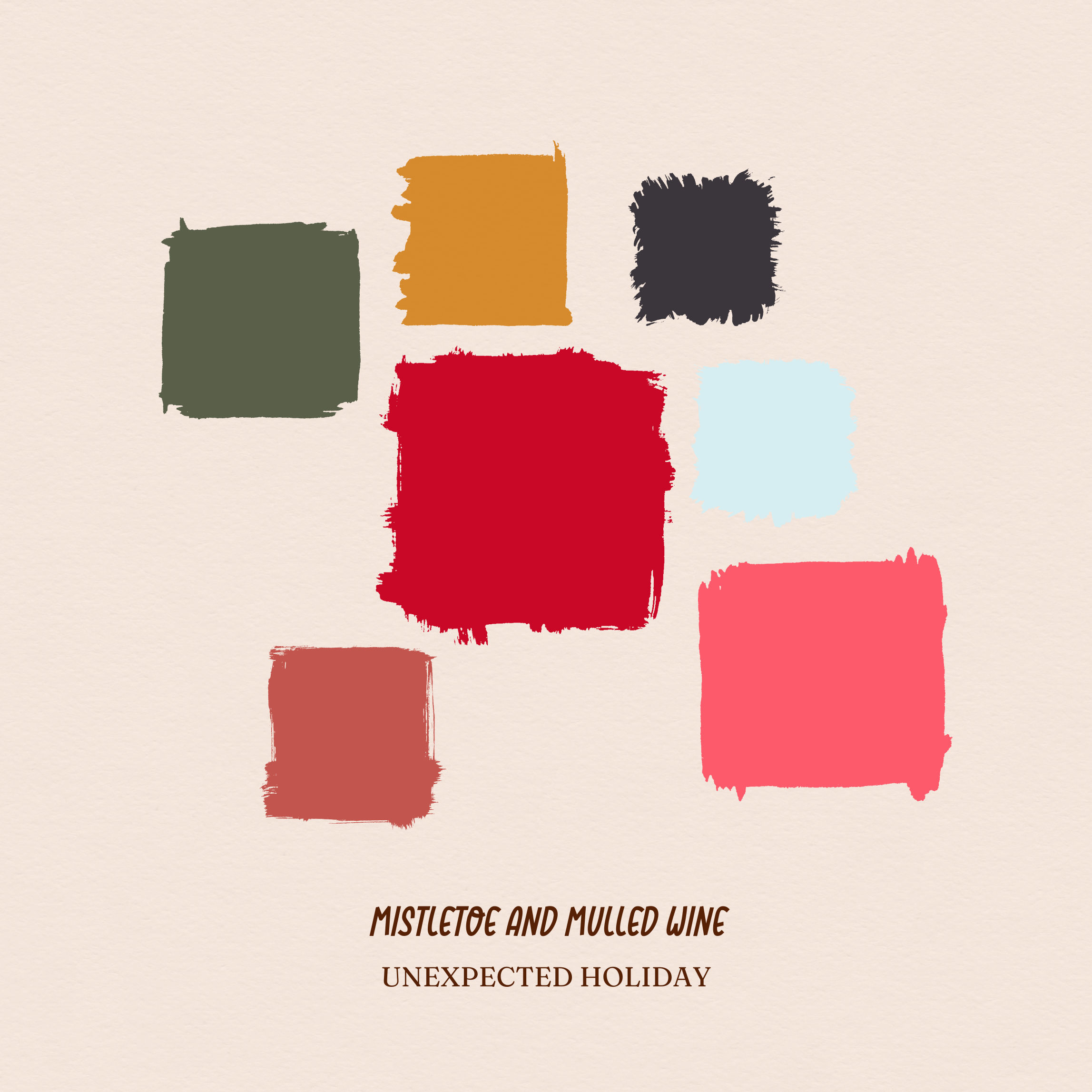
This one takes classic holiday warmth and turns it cinematic. Deep wines, evergreen, and gold are anchored by charcoal and ice blue, keeping the palette grounded, grown up, and surprisingly versatile. It reads festive, but also upscale.
Where it works: event branding, hospitality, boutique retail, luxe print pieces
3. Winter Spellbook
Energy: mystical, forest, nostalgic
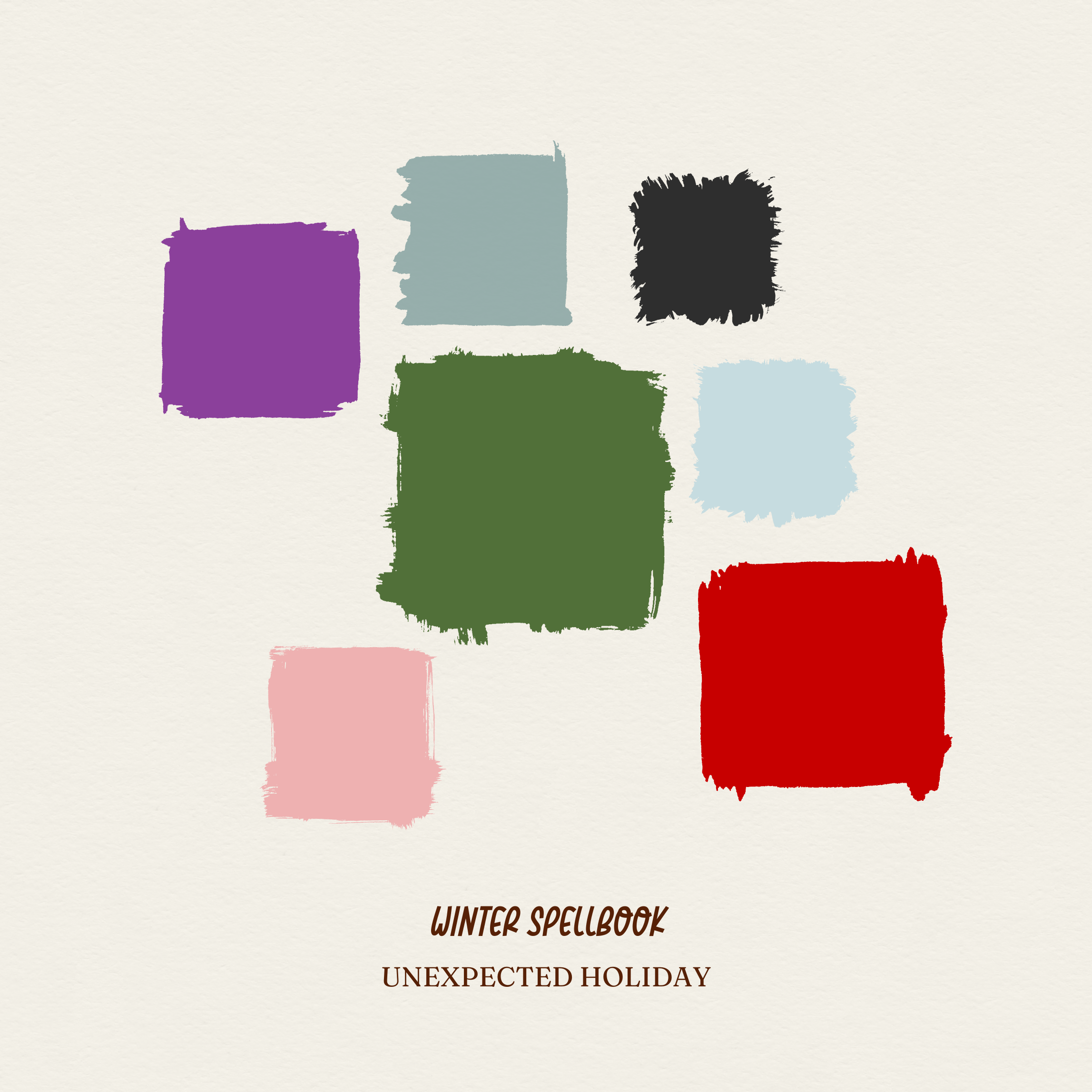
Holiday green meets enchanted purple and dusty blue for a winter palette that feels magical without the glitter. It is a little whimsical, a little moody, and perfect for brands that sit somewhere between cozy and eccentric.
Where it works: editorial layouts, handmade goods, indie shops, specialty markets
4. Cinnamon Street
Energy: cozy, vintage, warm
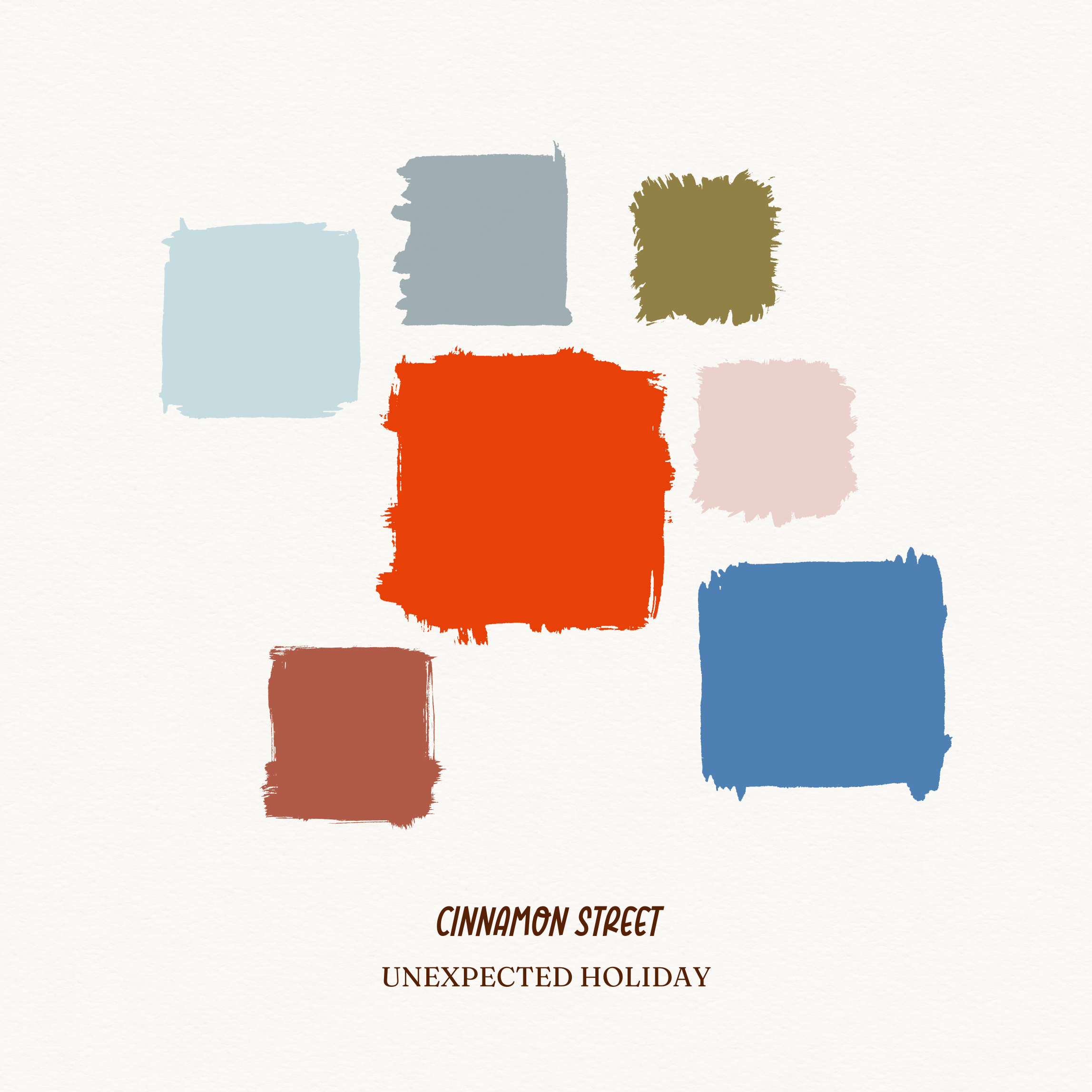
A softer interpretation of holiday warmth. Rust, clay, steel blue, and muted neutrals create a palette that feels handcrafted, comfortable, and familiar, but not dated. Imagine a winter cabin with good lighting and great ceramics.
Where it works: hospitality, coffee shops, home goods, print collateral
5. Vintage Holiday House
Energy: nostalgic, elevated, charming
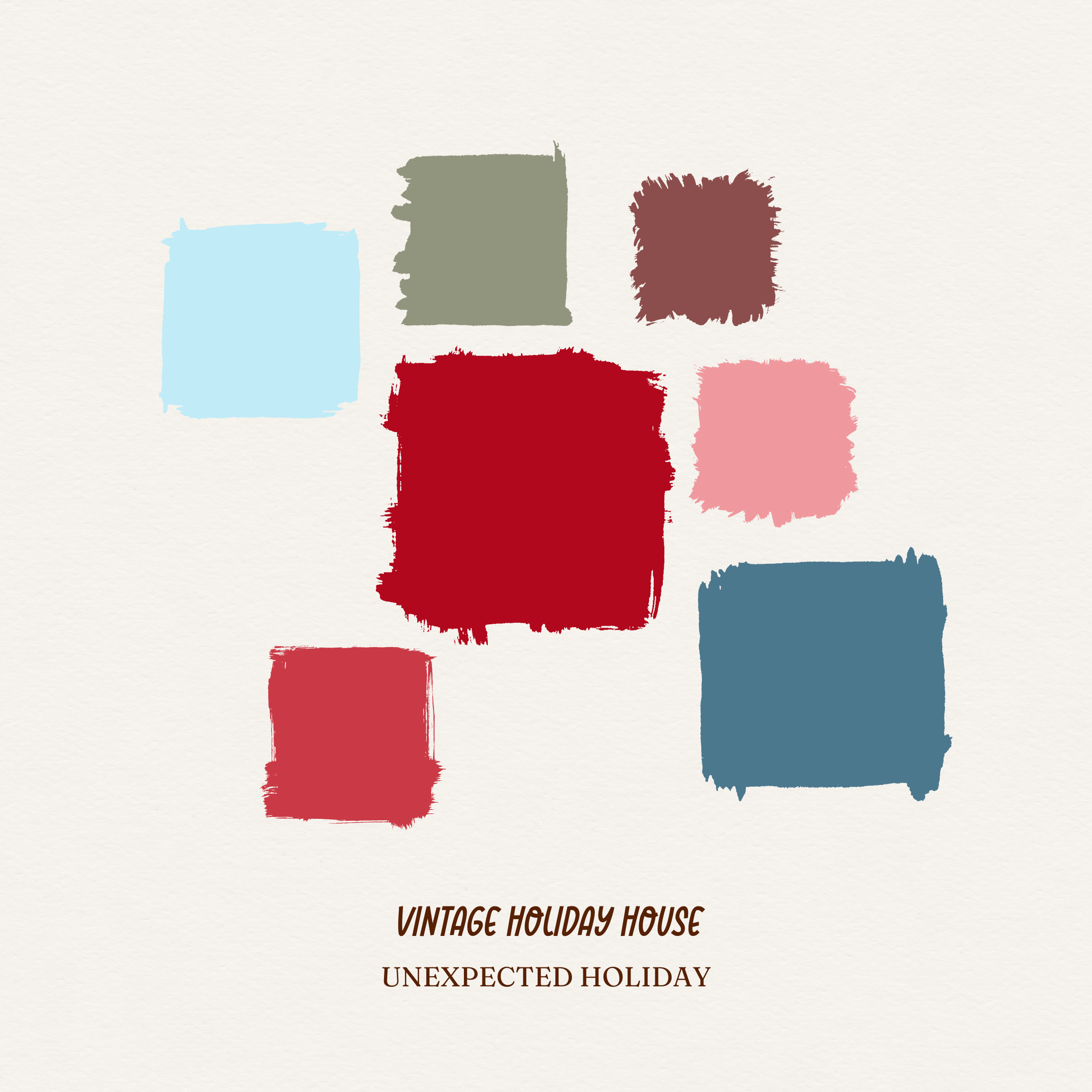
This palette nods to classic red and green, but pairs them with blush, dusty blue, and warm taupe for a more refined, midcentury feel. Seasonal, yes, but tasteful enough to exist outside of December.
Where it works: packaging, stationery, boutique retail, brand aesthetics
Tips for Using Seasonal Color Without Losing Brand Identity
Seasonal palettes don’t have to hijack your brand. They can support it. Try:
- Using one or two accents rather than rebuilding your system
- Pairing deep reds and greens with modern neutrals
- Leaning into texture or illustration to reinforce personality
- Choosing palettes that fit your brand’s core mood
Holiday can be a moment, not a makeover.
So, basically…
Holiday color codes don’t have to scream “December” to feel festive. With the right balance of classic tones and modern adjustments, you can create seasonal designs that feel intentional, elevated, and aligned with your brand — not like a last-minute holiday overlay.
If you want to take these palettes even further, typography plays a huge role in how holiday design comes together. Once you’ve nailed your colors, head next to Best Holiday Fonts to see which typefaces pair beautifully with seasonal palettes without tipping into kitsch.
Color sets the mood — type brings it to life.
